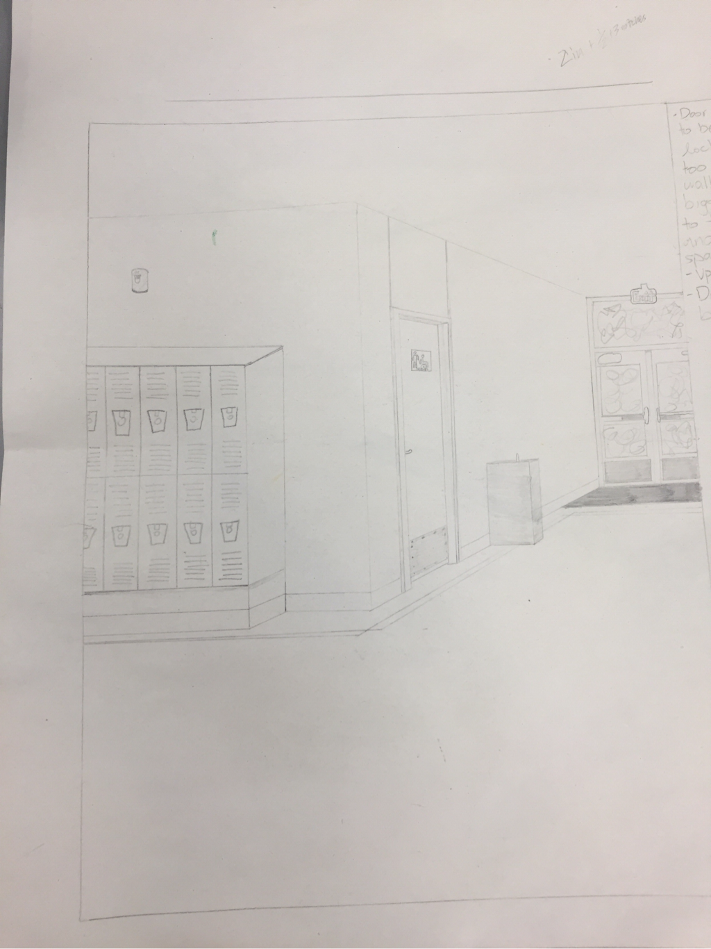
For our last project, we were told to make two projects. I made two 2-vanishing point drawings of the school. I used lines to make the art look 3D. I tried to use value as well to get try and get the same affect. I used the design element of proportion to make an accurate drawing. I took pictures of the school and drew them. The way that I did that was proportion. I chose to draw the school because I liked how the hallways and the outside of the school look.
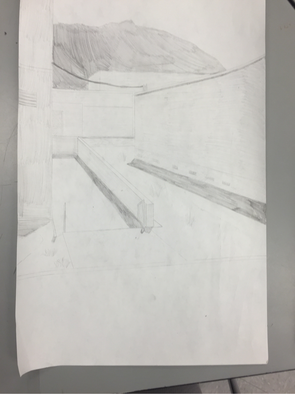
This week in art we were given a choice project. I chose to do a two point perspective drawing of the side of the school, again. For some reason I like the calmness of the building when no one is around. I improved on my shadowing. I asked you for help on this and I thought it turned out okay, lots of room for improvement. I used lines to create this drawing and connected them to the vanishing point. The hardest part of this was short stone wall. I struggled finding the right angle for it and it didn't turn out as well as I wanted to.
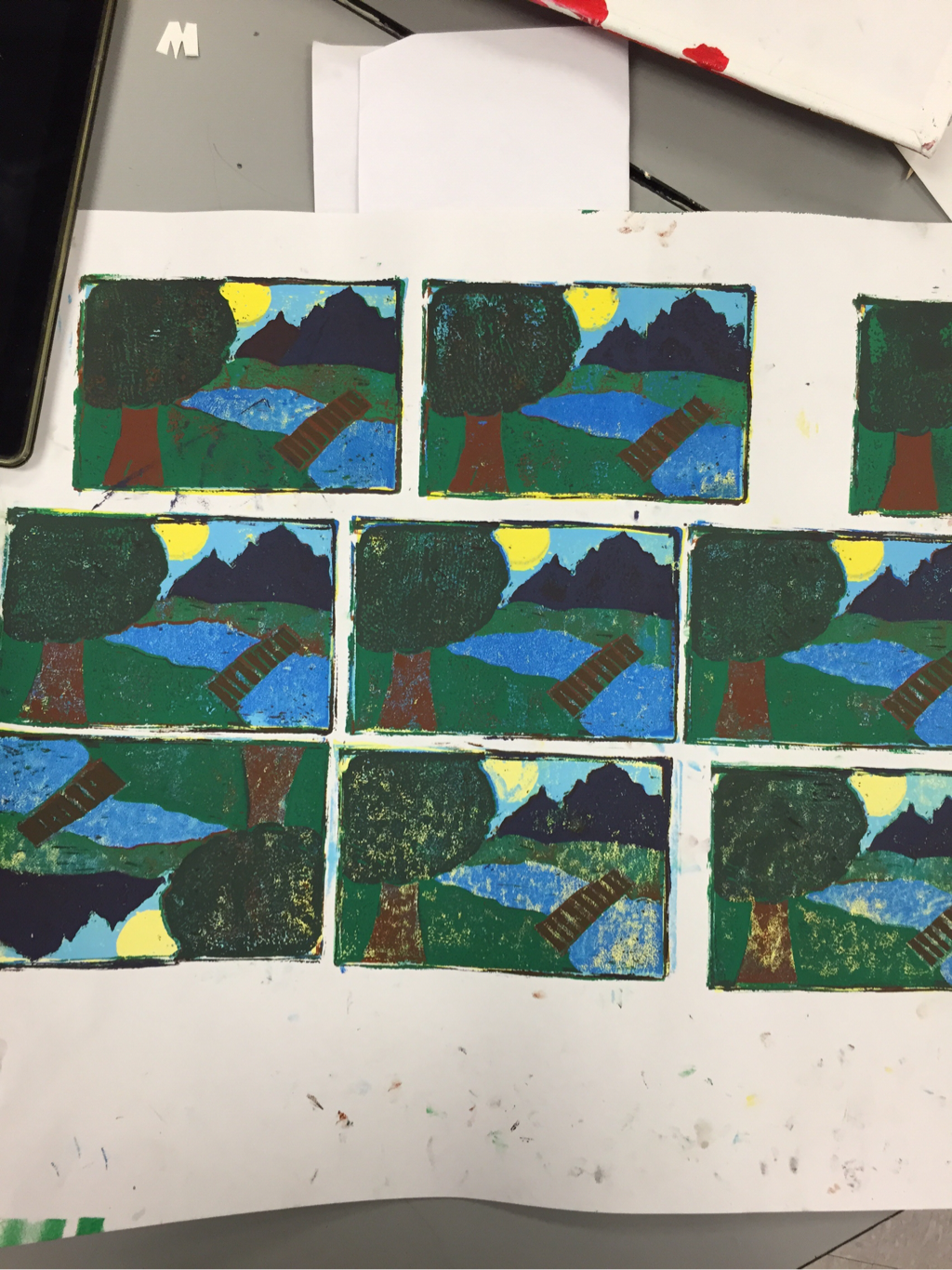
This week in art we made block prints on paper. It was the second time I had done this project, went much better than the first. For this I drew a sketch of a landscape on paper, then I transferred it to the block. From there I rolled on one layer of paint at a time and cut out what I did not want colored as I went forward. Originally, I wanted to make each row of prints lights, but we ran out of white. I had to adapt to the change so I decided to just make all of them the same color. In the end, it all worked out and I was able to make something resembling a landscape. I used depth in the art to make it more realistic. I was going to use the art element color, as I mentioned before with the white. Using depth and color, I was able to finish the project.
For the art project we painted a self portrait on canvas. For me it was the first time I'd used canvas. At first I thought it would be quite difficult but I only had a few setbacks. At one point I accidentally tore up some of the layered paint and had to doctor it back. I improved my portrait drawing with this project. Though this one isn't perfect, I felt that it was good work, personally. One skill I learned/improved was value. I didn't know the tone of the color could show direction, position, shape, etc. I tried to make it look like I was looking at a 75 degree angle. Maybe I did maybe I didn't but that was the goal. I usually don't like drawing faces, it's not consistent like buildings or landscapes. Most buildings and trees look somewhat similar but faces are all different. Everyone has different features and sometimes it's hard to be a good judge of what that human is supposed to look like on a drawing. Before I started I was frustrated that we had to draw a self portrait, as time went on I started to enjoy it a lot more using the techniques you showed in class. I could go into some little things but that is probably boring to read about so I'll end here.

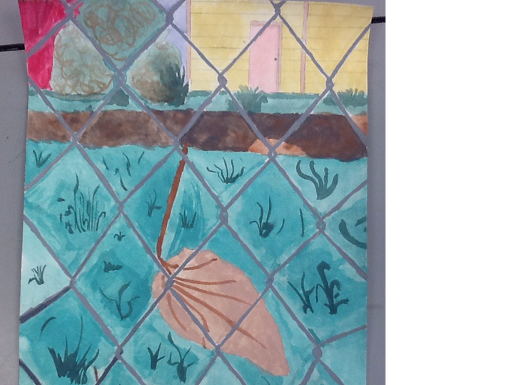
This art project is of a spot on a fence around Mount Si High School. I used watercolors, they help blend colors and it is easy to control how light and dark something is. I started by drawing the lines in pencil. Then I created a back ground with green for grass and brown for dirt. After, I painted in some details to the best of my ability. I finished painting every detail I wanted to then I moved onto the fence. The fence was definitely the hardest part. I'm inexperienced with watercolors, and art in general, so at times it was frustrating getting proper colors or using the right amount of water. Eventually I found the right color combination and painted in the fence. I tried to use line value, form, and space to create this project. I chose this micro-landscape because I liked the area around it, I wish I had chosen a different one, though. This one took a lot more time than I wanted it to and was harder for me than I anticipated, but I wanted to finish what I started even if it may have turned out bad. The houses in the back are different colors in real life. I changed them to pop out a bit more as the dull tan color wasn't as exciting to me. Also the sky wasn't blue in the picture, I changed that too as more gray would have looked bad.
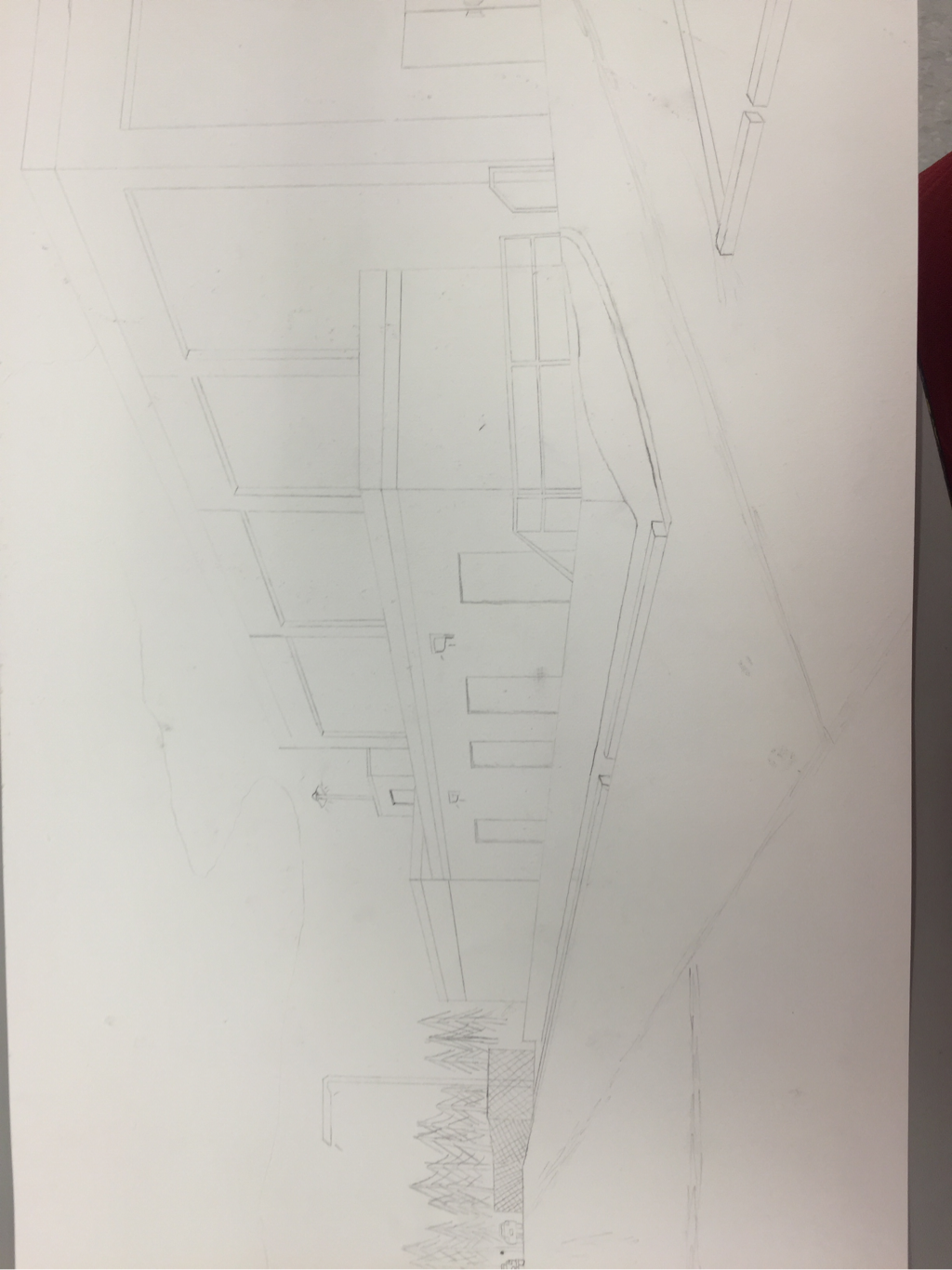
This project is a two point perspective drawing of the side of Mount Si High School. It uses vanishing points to create a 3D effect. I chose this side of the school because I liked the calmness around that area at the time. I could have gone to the front of the school and used a more aesthetic part of the building, but I decided on this. Originally I wanted to make it appear that it was raining and include a garbage truck picking up one of the large trash containers. That proved to be above my skill level so instead I added clouds, a fence, and cars to fill empty space. This project helped me learn to fill empty space. I probably spent too long deciding what to put but I now I have a better idea of what I want to do with the space. I used the art element shape to make building appear more realistic. Using these skills I was able to complete my landscape drawing.
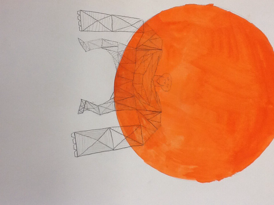
This is my geometric animal drawing. We were told to pick our spirit animal or any animal we wanted to. I decided to go with the chimpanzee. I started by sketching a picture of a chimp without geometric shapes before I began the geometric version. This helped me create a more accurate version of my animal. I used line direction in my art to make it look 3D. I also was able to work on my hatching skills. Using these elements I was able to make a geometric chimpanzee.